It was early 2020 when the previous principal at St. Thomas Aquinas Academy approached a group of parents to start a marketing committee for the school.
The goal was to spread the word about the school, located east of I-43 and south of Howard Avenue, and all that it had to offer. A total of 10 parent volunteers attended the first meeting, and the agenda was to discuss strategies for recruitment and advertising. But before they could get to that, it became obvious that they needed to really focus on who they were as a community — and it all began with their branding.
“All of a sudden, our conversation turned to the need for a new logo,” said Jennifer Sanchez, who became the head of the marketing committee.
While they already had a main school logo, there were some issues with it. Among the problems with the previous “archway” logo were the thin lines, which made it hard to reproduce. The school had several different interpretations of that mark, leading to some confusion on which mark should be used and when.
Enter Sandy Copp, another parent volunteer and member of the marketing committee with 20 years of graphic design experience.
“We thought it was time to look at it in terms of something that’s more iconic and easy to recognize,” Copp said.
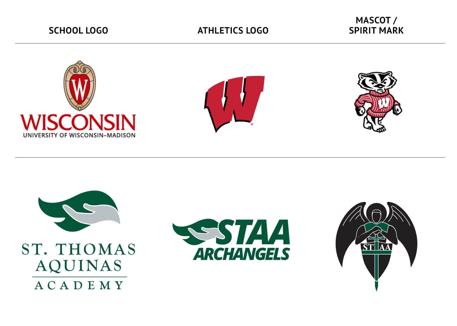
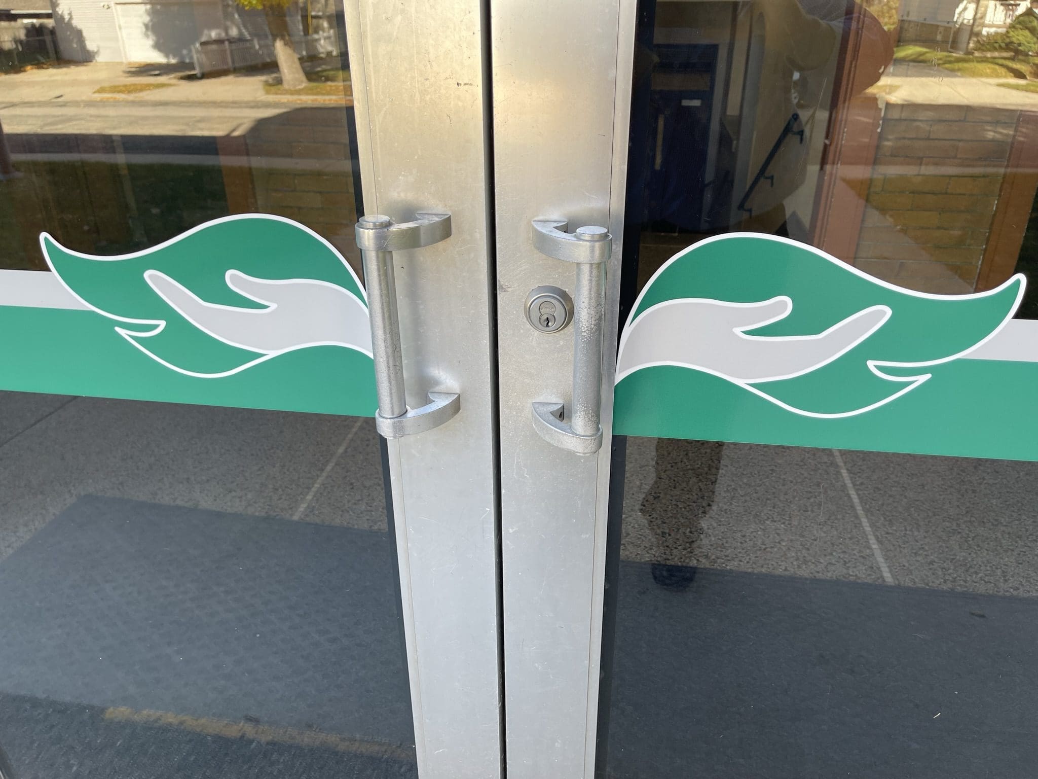
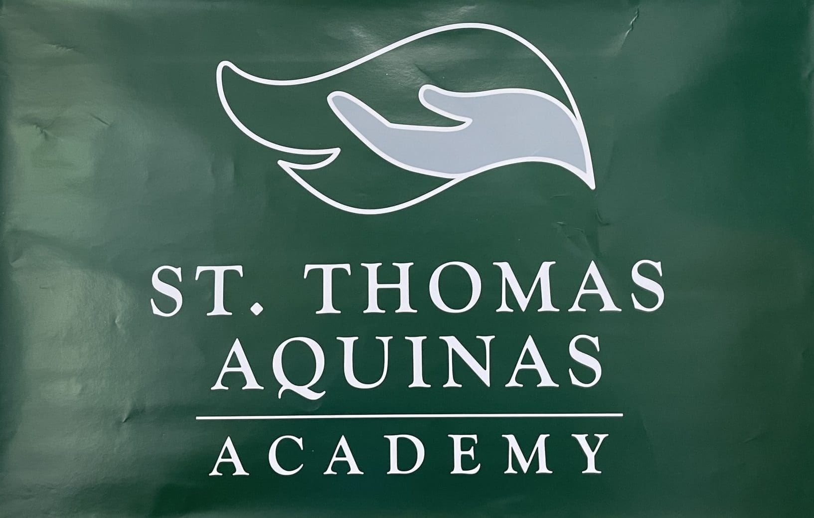
The result? A visually striking new brand mark that features a silver hand overlaid against a forest green wing of an archangel, the school’s athletic mascot, with white trim. Sanchez and Copp said they have also had people tell them they can see a flame in the design.
“I didn’t think I was going to be the one designing it,” Copp said. “I was hoping I would. I thought for sure other people would want to try to do this. It’s a pretty big job (and one I’m) honored to do.”
Sanchez cautioned, however, that the committee had a lot of work to do before it could get to the design stage. Members of the committee, selected because of their expertise, experience and areas of interest, knew they couldn’t unilaterally be the voice of the school. Whatever came out of the committee also had to have the “blessing” of the pastor, staff, teachers, parents and students. And thus began a variety of group meetings, school-wide surveys and informational presentations to all those who had a “stake” in the school.
The visual elements were a result of school surveys in April 2020 and May 2021, asking students, parents and staff for three words to describe the school. The ones that continually rose to the top of the list were Academics, Faith and Community.
Copp believes the new rebranding is a reflection of what the school means to its stakeholders.
“One of our beliefs at St. Thomas Aquinas is we are the hands of God,” said Andrea Bergmann, now in her second year as principal. Members of the marketing committee described Bergmann, who picked up the mantle when she arrived at the school, as being very supportive of the process.
The design phase began in the summer of 2021 and Copp said she completed more than 100 sketches, but the eventual winner leaped out at her almost immediately.
“When I drew that logo, I knew it was the one,” Copp said.
After she was done with her sketches, Copp showed a few sketches to the committee, and the new mark was shown to stakeholders in the school, including the staff at Seton Catholic Schools, teachers and Fr. Carmelo Giuffre, who is a shared pastor for three of the school’s six supporting parishes.
“We thought it was important to keep the colors, because that was our established identity,” Copp said. “Plus, logistically, there’s a lot of colors throughout the school that we would have to go through and update. We also didn’t want to shock people by changing too drastically.”
The new mark was unveiled in April, and the school had a soft launch, which included a YouTube video called “Spreading Our Wings With a New Look” (https://www.youtube.com/watch?v=N_dJSPtzbJY), where Sanchez and Copp described some of the work and thought processes that went into the project.
Since the unveiling, the school has been, and still is, in the implementation phase, where they are changing posters and signage around the building, and they have added vinyl versions of the new logo to the doors to the school.
The reaction among students and parents has been overwhelmingly positive, as evidenced by a recent week-long spirit wear sale, where they did spectacular business.
“People are excited about it, and they want to stock up now while they can,” Copp said.
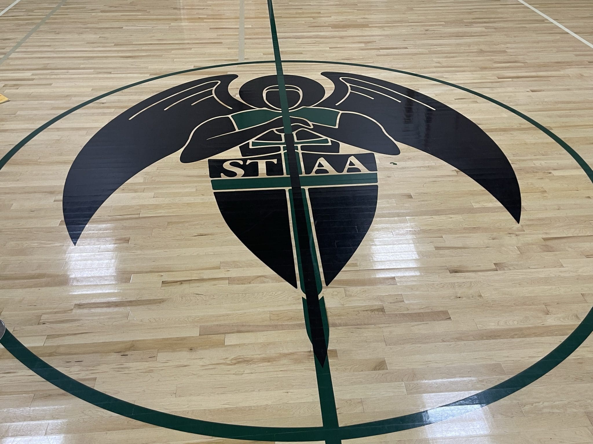
One thing that won’t change, however, is the Archangel mascot logo on the gym floor. Copp describes it like how the University of Wisconsin uses its three main marks: the academic logo (the vertical W on the crest), the athletic logo (the motion W) and the mascot logo (strutting Bucky).
“We were not going to touch that,” Sanchez said. “It’s beautiful and our school loves it.”
After going through the long process, which was delayed at times because of the COVID-19 pandemic, Copp has one other word of warning (in addition to not short-changing your timelines) for schools who may wish to implement a similar change in the future.
“Make sure your decision is well-thought-out,” Copp said. “Make sure you have a reason for doing what you’re doing. It will cause some concern among other people if they don’t understand why you’re doing it.”
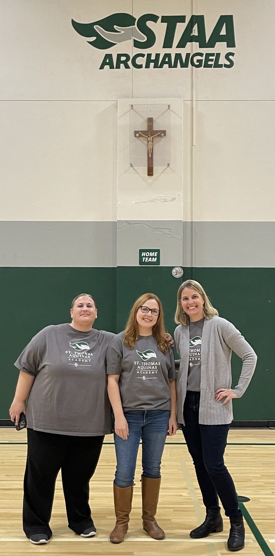
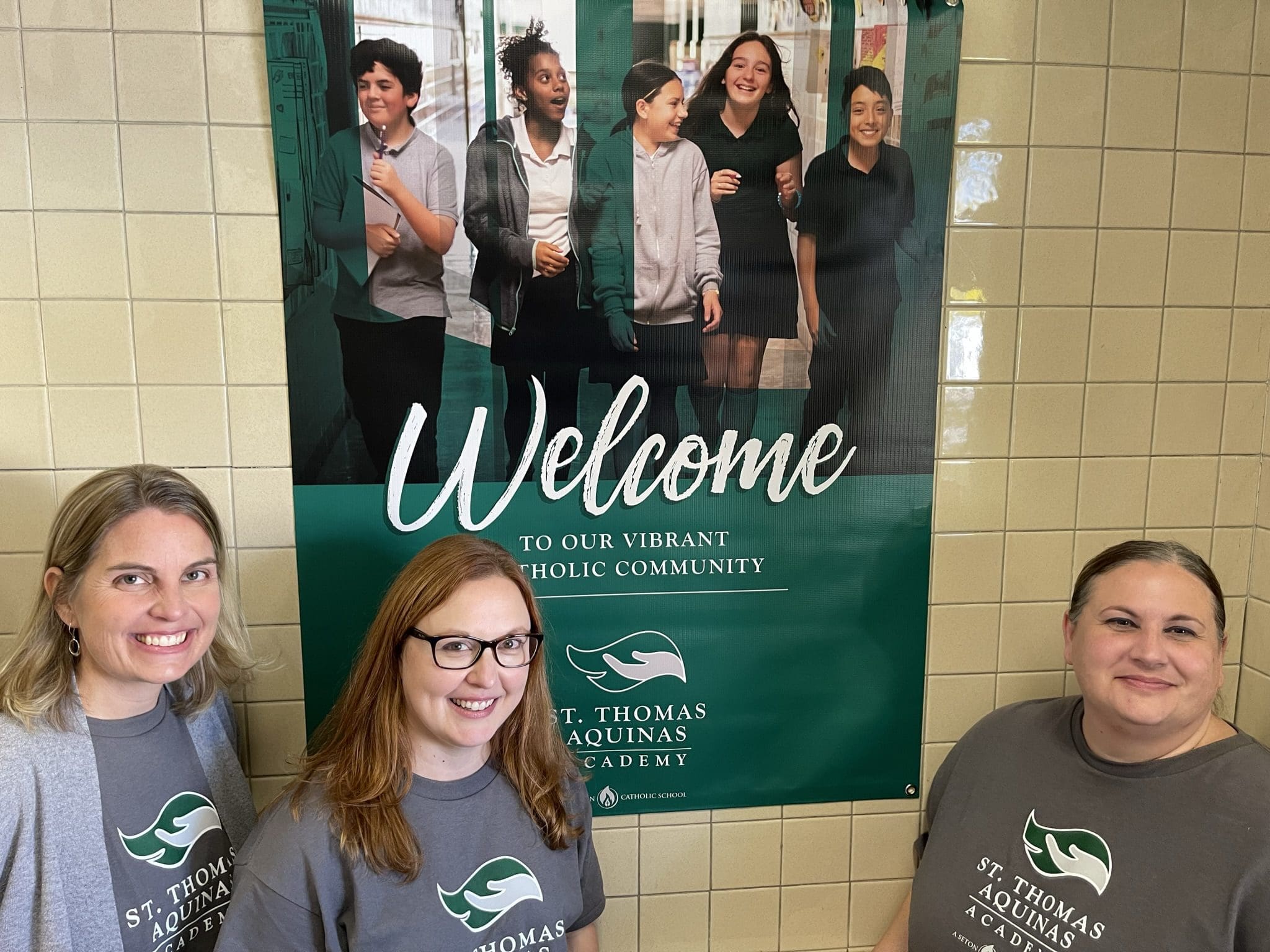
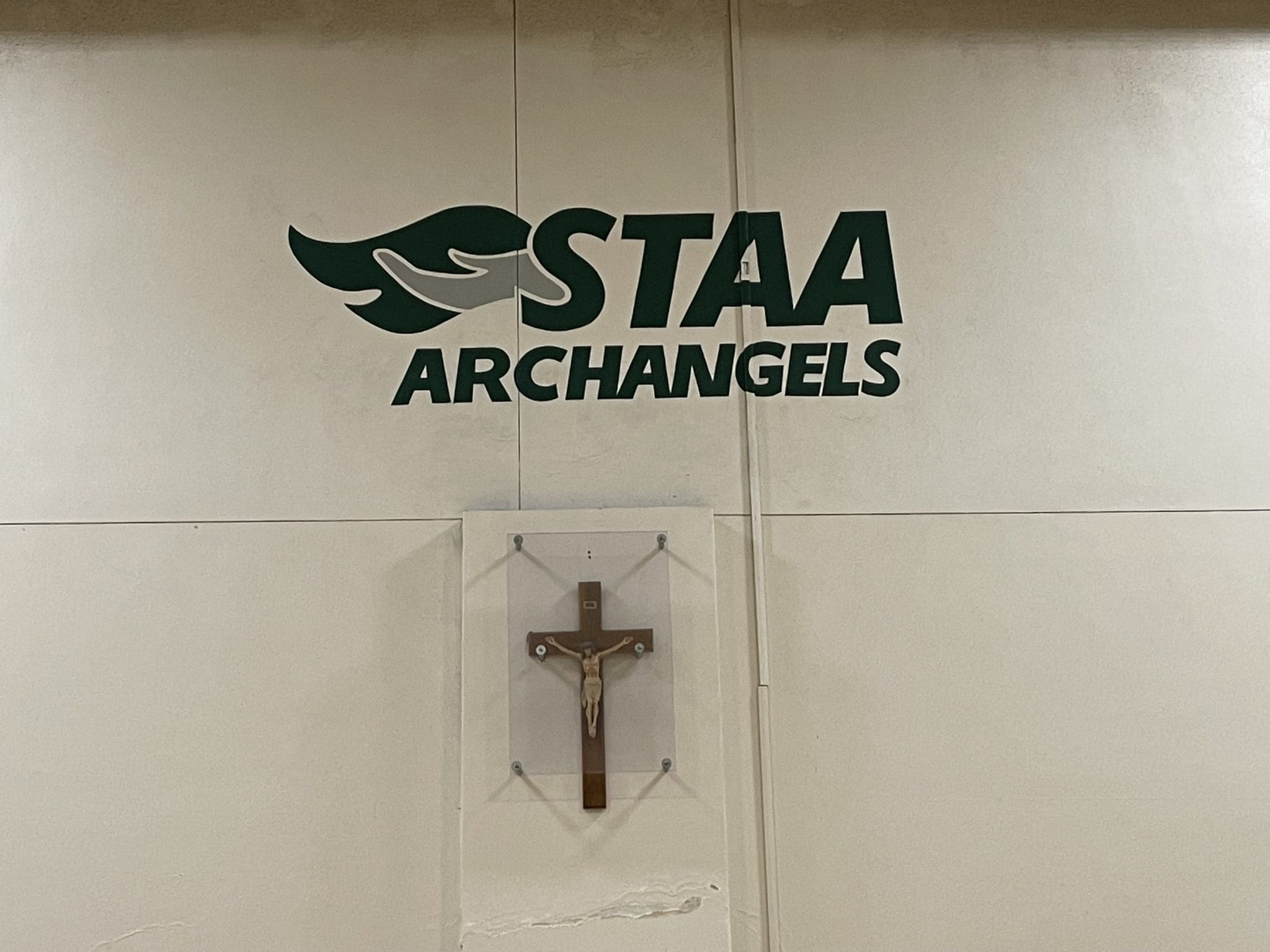
St. Thomas Aquinas Principal Andrea Bergmann (left), along with marketing committee members Sandy Copp and Jennifer Sanchez, displays the school’s new standard logo (on their shirts) and the new athletics logo (on the wall). (Photo by Larry Hanson)
